With the introduction of Components, you can now create reusable elements that instantly sync across all instances of that element within your Moqups project.

Turn any single object or group into a Component, and all copies of that element will automatically inherit any changes made to the original. This way, your team can apply quick, consistent updates within projects, and avoid the tedium of reformatting over and over – one object at a time.
By making it easier to tweak elements throughout a project, Components encourage teams to experiment freely, iterate and test more often, and accelerate the overall design and development process.
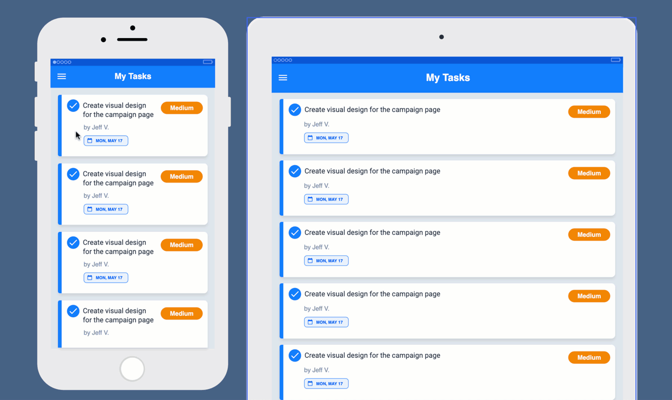
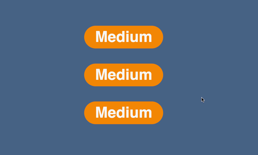
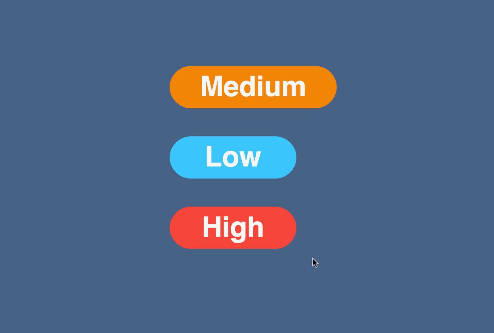
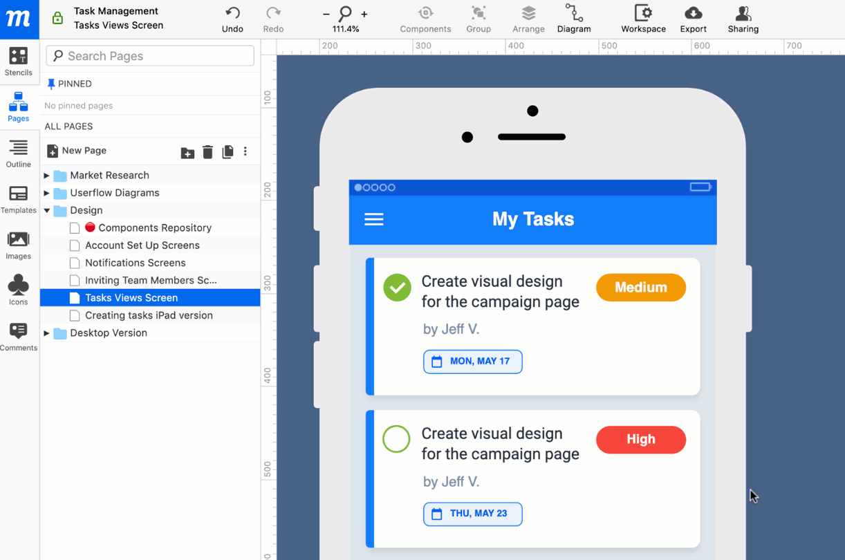
Components are particularly useful when creating and maintaining frequently repeated UI elements like headers, footers, logos, icons, modals, and device or platform-specific templates.
And the best thing about using components as a foundation tool, is that they have a cumulative effect; over time, the more components you add, and the more you nest instances, the faster and more efficient your future execution becomes.

That’s why components – sometimes named ‘symbols’ – have become such an essential tool for building design systems. But you don’t have to be working within a comprehensive design system to take advantage of components’ power. They can smooth and speed any type of workflow – on any kind of project!
You may have already noticed the new Components button in our top-toolbar. You’ll find all of the Component and Instance controls there, and in the Component section of the right-click Context Menu. Let’s take a look at how they work:
Creating Components and Instances
Once you turn an object or group into a Component, it acts as a master to any and all copies – or Instances – that are made from that component.
That means that any formatting you apply to the Component is immediately reflected by every Instance in the project.
However, for maximum flexibility, instances remain independent of the component in their Coordinates (including Flip and Rotate), and Visibility. This means you can relocate or hide components without affecting the position or visibility of their instances.
To create a Component:
- Select any object or group on the page.
- From the Component button in the Top Toolbar, or the Component section of the right-click Context Menu, choose Create Component.
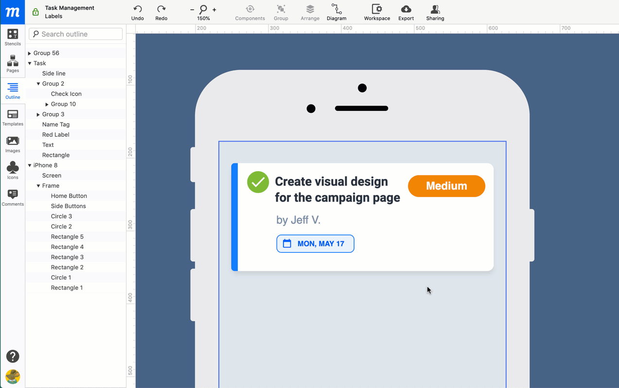
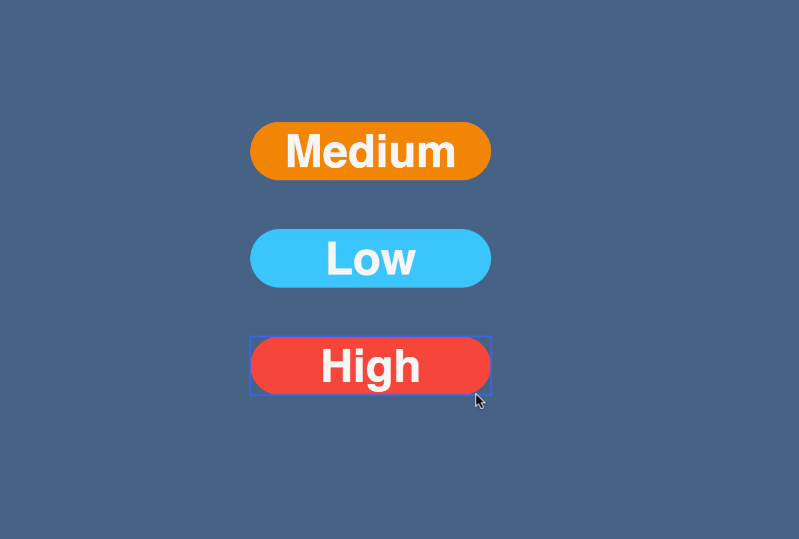
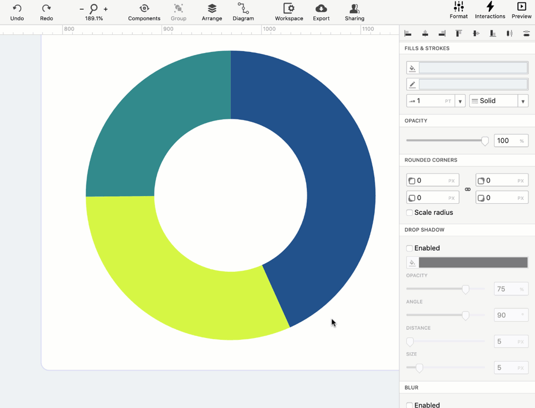
- Once created and selected, Components are identifiable by their orange ‘Component’ label, badge and frame; in the Outline panel, they are identified by an orange highlight.

To create an Instance:
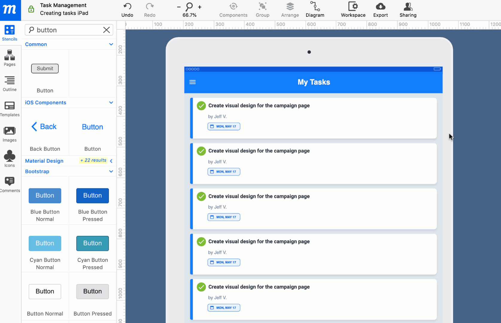
- Make a copy of the Component using Ctrl/Cmd + D, the Duplicate option in the Context menu, or simply hold down Alt/Option and drag.
- You can paste the Instance to any page within the project
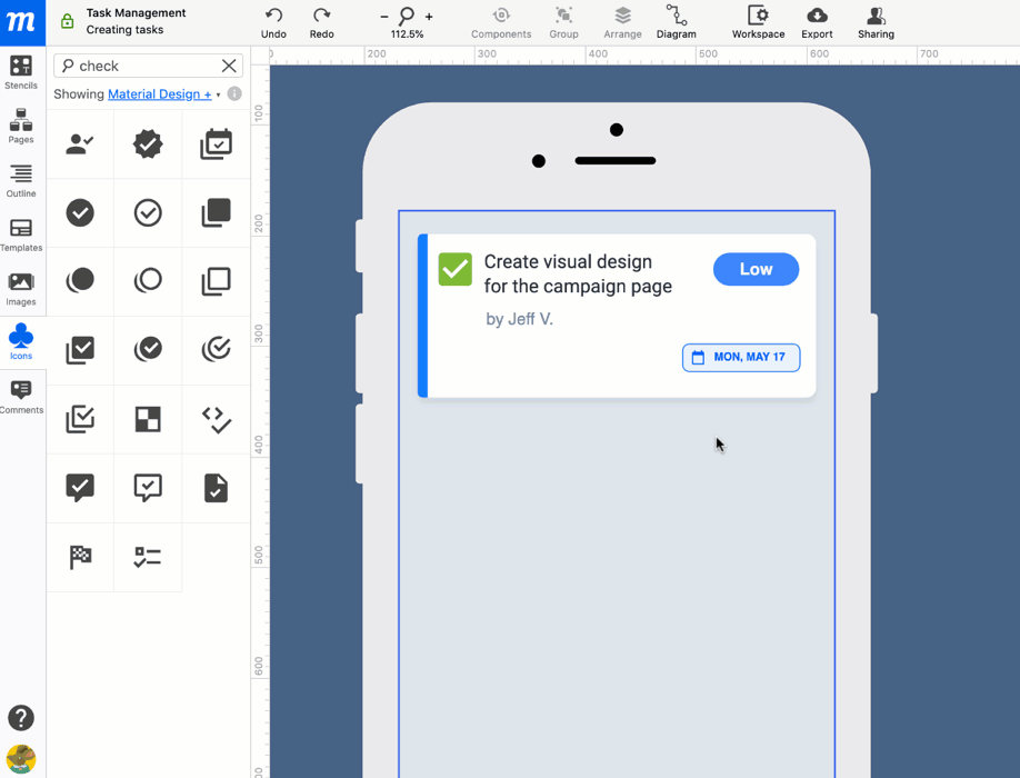
- Now, change the size, text, color, or other formatting attributes of the Component
- Once the changes are complete, click outside the Component’s object-frame – and watch the changes propagate to all Instances within the project.

Editing and Adding New Objects
Components and Instances – even those made from single objects – behave like groups. To edit any component or instance:
- Select it so you see the orange Object-Frame.
- Then, double-click so the thicker Component Edit Border appears in orange.
- Now, you can…
-
- Click through to edit
- Add a new element from the left-sidebar
- Copy and paste an object in from the page itself
-

Applying Overrides to an Instance
Sometimes, you may want to customize part of an individual instance, yet still leave it connected and responsive to its component for other changes and updates. For example, you might want to change at CTA’s color on a specific page, but still want that button to sync with its master for any future changes in size and text.
That’s why any changes made locally, to any individual instance overrides the component’s ability to change that specific formatting attribute (text, color, blur, rounded corners) in the future.

And any overrides applied locally will have no effect on other instances, or the original Component itself. This allows your team to be consistent in design, but still responsive to the particular context of each instance.
Detaching and Resetting an Instance
If you’ve made local modifications to an individual instance, but then want to remove those overrides and re-apply the full style and properties of the component, select Reset Instance.

And, if you want to turn an instance back into a normal object or group, just select Detach Instance.

Locating and Restoring Components
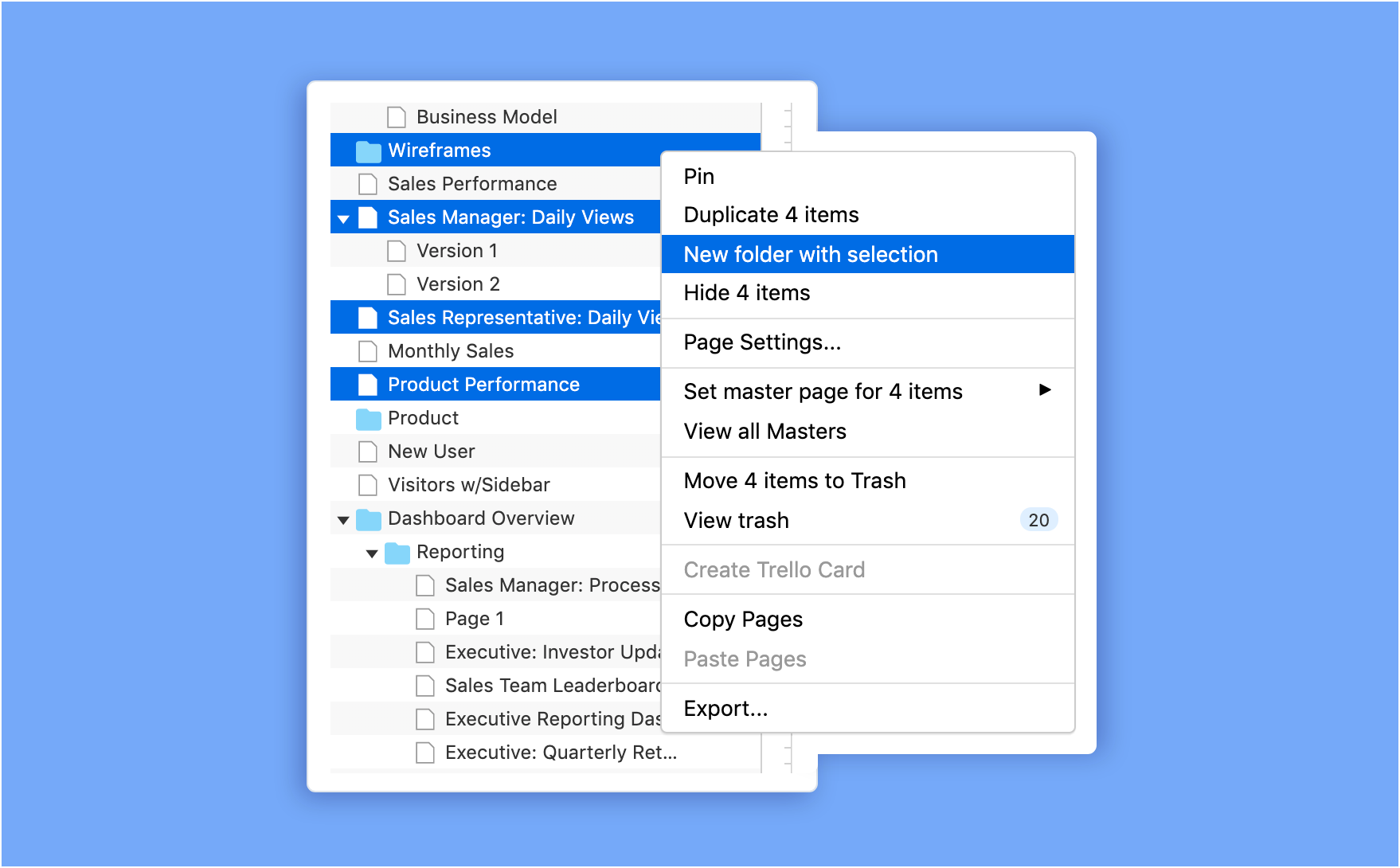
You can leave individual Components in the context of a design, or create a separate project page where all your components can live – and then pin that page to the top of the Pages Panel.
And, if you’re working with an instance, and need to check or tweak the component itself, just click on the instance and select Go to Component from the menu. No matter where the instance is, you’ll jump immediately to its Component’s location within the project.

If, for some reason, you delete a Component, and leave orphaned instances behind, just select any instance and choose the Restore Component option – and the component will magically reappear! Note that this works even for instances with overrides – you’ll still get the original component back.

Components can help reduce errors, ensure consistency and, most importantly, save time by freeing your team from the tedious, repetitive work of updating and reformatting.
As always, we want to hear your feedback, so we can continue to improve your experience. So, please send us your feedback and suggestions at support@moqups.com .